

 All articles
Design F — Jan Robert Dünnweller
Concept description by Jan Robert Dünnweller
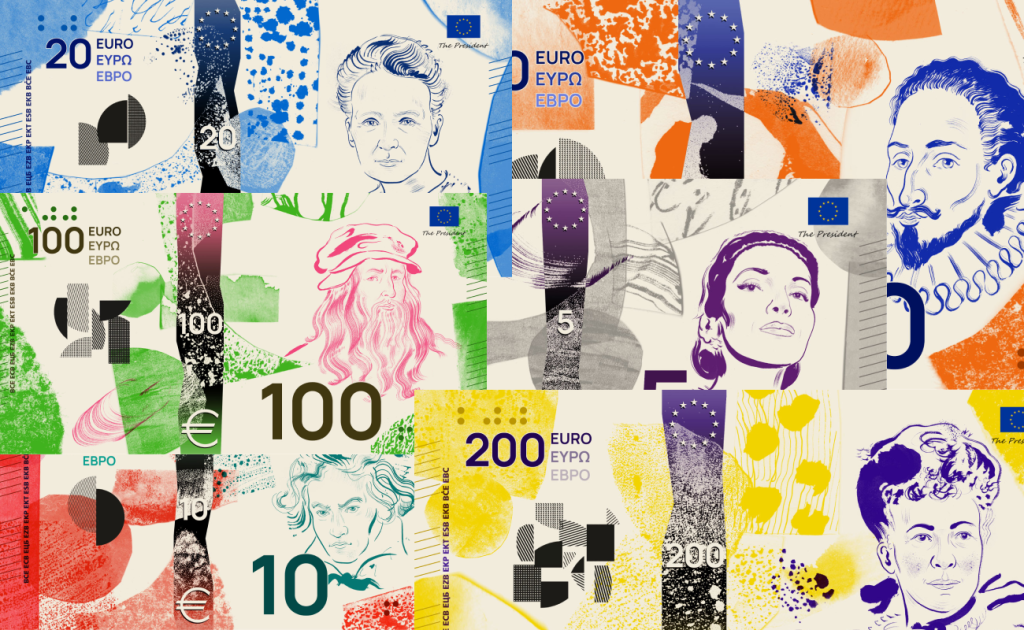
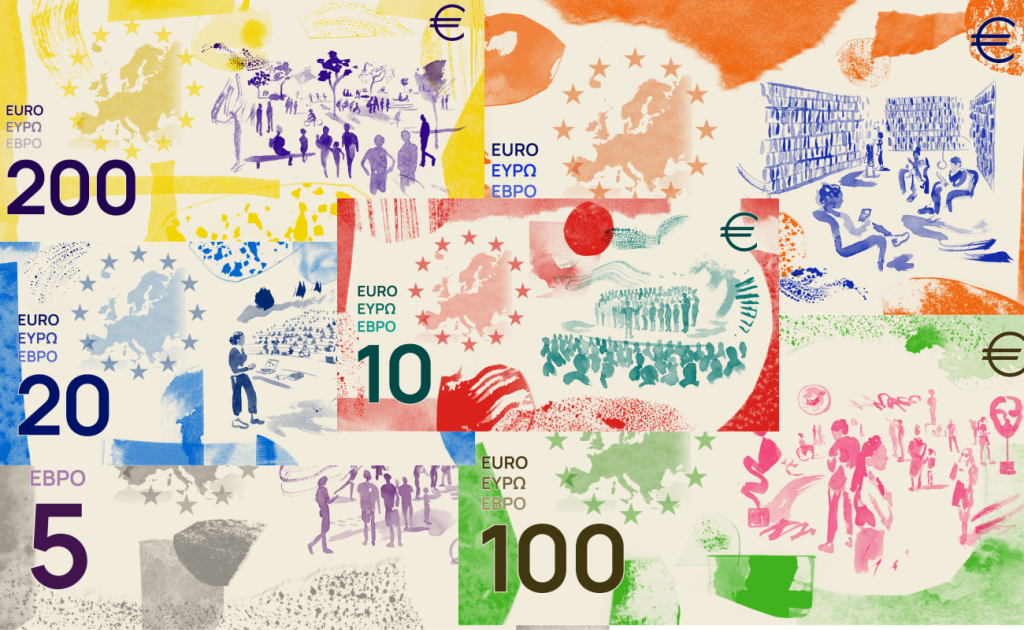
“The design aims to illustrate the official motto of the EU – ‘United in diversity’. Europe is united by a rich shared cultural history and heritage, represented by the portraits of iconic European figures. It is united by shared values and a sense of belonging, strengthened by the diversity of cultural identities.
This diversity is visualised in a collage through a multitude of forms and textures that together create a new whole, uniting these different elements. The collage forms the background for the hand-drawn portraits and depictions of shared cultural spaces as concrete manifestations of these ideas.”
I have to admit, this concept genuinely stunned me. Taking such a formalized design brief and interpreting it in this visual language requires an incredibly bold designer. I like almost everything here: the hand-drawn lines, watercolor, use of paint, textures, scuffs, rough surfaces, and brushstrokes. Together, they create a genuine visual spectacle.
What I find especially interesting is how freely the design treats the familiar aesthetics of banknotes. It feels fresh, unconventional, and completely unlike what you would normally expect from a currency — especially the euro. The only element that gave me some pause is the color combination on the €100 note with the pink Leonardo da Vinci. Even then, the banknote still looks striking and interesting.
I especially love the reverse. The original brief is, in itself, fairly dry: cultural spaces, human interaction, shared European identity. Here, however, all of that is transformed into vivid watercolor compositions that seem to exist in an entirely different visual reality. The map of Europe, people, architecture, fields of paint, lines, and textures do not feel like a checklist of required elements. They actually come together as a complete image.
At the same time, I am almost certain that this concept could end up being one of the outsiders in the competition. It is one thing to judge it as a visual work — for its courage, originality, and artistic language — and another to consider it as an actual mass-market currency. In my opinion, the solution may simply be too bold, not only technically but also in terms of public perception.
To sum it up, from a conceptual and visual standpoint, this is my clear favorite at this stage. I have not seen such a bold and unfiltered vision of what contemporary currency design could be in a long time. It has character, its own voice, and an actual design idea rather than simply being a polished interpretation of the brief. But that same courage may ultimately become its biggest weakness in a real competition.ильним для мене, водночас може стати його головним недоліком у межах реального конкурсу.
Design G — Rubio & del Amo and Cruz más Cruz
Concept description by Rubio & del Amo and Cruz más Cruz
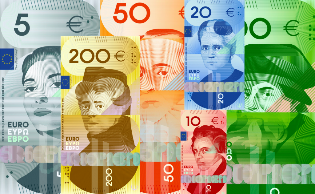
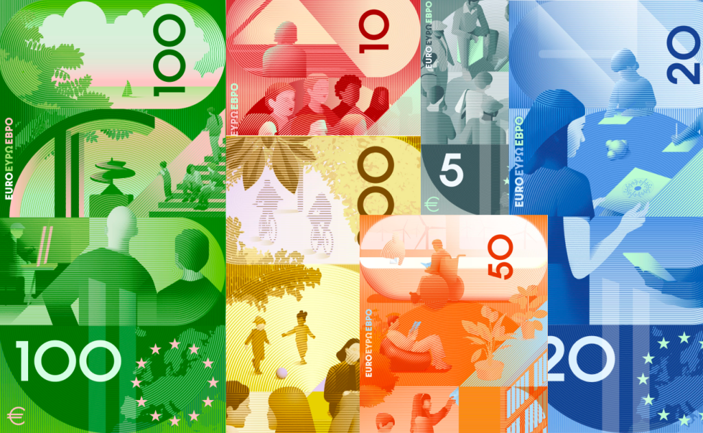
“An engaging gaze meets the viewer from the centre of the banknote. It encapsulates a proposal, an idea and a dialogue between those who have forged our cultural identity and those of us who are making Europe a place at the forefront of thought, keeping the spirit of these figures alive in our daily lives.
A dominant, consistent and recognisable colour meets a linear pattern that provides a shared texture, within a structure that holds the whole together. If we turn the banknotes horizontally, we see four vertical blocks, each inspired by a letter: ‘E’, ‘U’, ‘R’ and ‘O’.”
Of all the concepts featuring historical figures on the front and human interaction on the reverse, this one feels like the most likely winner to me. It finds a very convincing balance between experimentation and still feeling like real currency.
The series reminds me somewhat of the previous generation of the Israeli new shekel, especially in its vertical logic and the way the historical figure becomes the central element of the composition. I have always loved vertical banknotes, and here the portraits are stylized exactly the way I would like to see them in a contemporary euro redesign: they do not exist separately from the graphic system but become part of it.
The currency itself also feels distinctly futuristic — at times almost sci-fi — which I consider a major strength. Geometric forms, pseudo-3D, flat elements, linear textures, and carefully selected colors all work together surprisingly well. The portraits are unconventional without losing their seriousness, while the iridescent EURO lettering is almost a visual pleasure in itself.
The reverse is also one of the strongest among all the culture-themed proposals. People, spaces, and architecture are treated in the same visual language as the front, so the two sides finally feel like part of one coherent system. Color, geometry, implied depth, and scenes of human interaction all come together.
To sum it up, this is the concept with historical figures that feels closest to me. I love the portraits, the futurism, the compositional logic, the color, and the overall way of thinking behind it. This is exactly the level of transformation I expect from a banknote redesign in the 21st century: not another careful modernization of the old system, but a genuine attempt to imagine what the currency of the future could look like.
Design H — Atelier Goppel-Toperngpong
Design H — Atelier Goppel-Toperngpong
Concept description by Atelier Goppel-Toperngpong
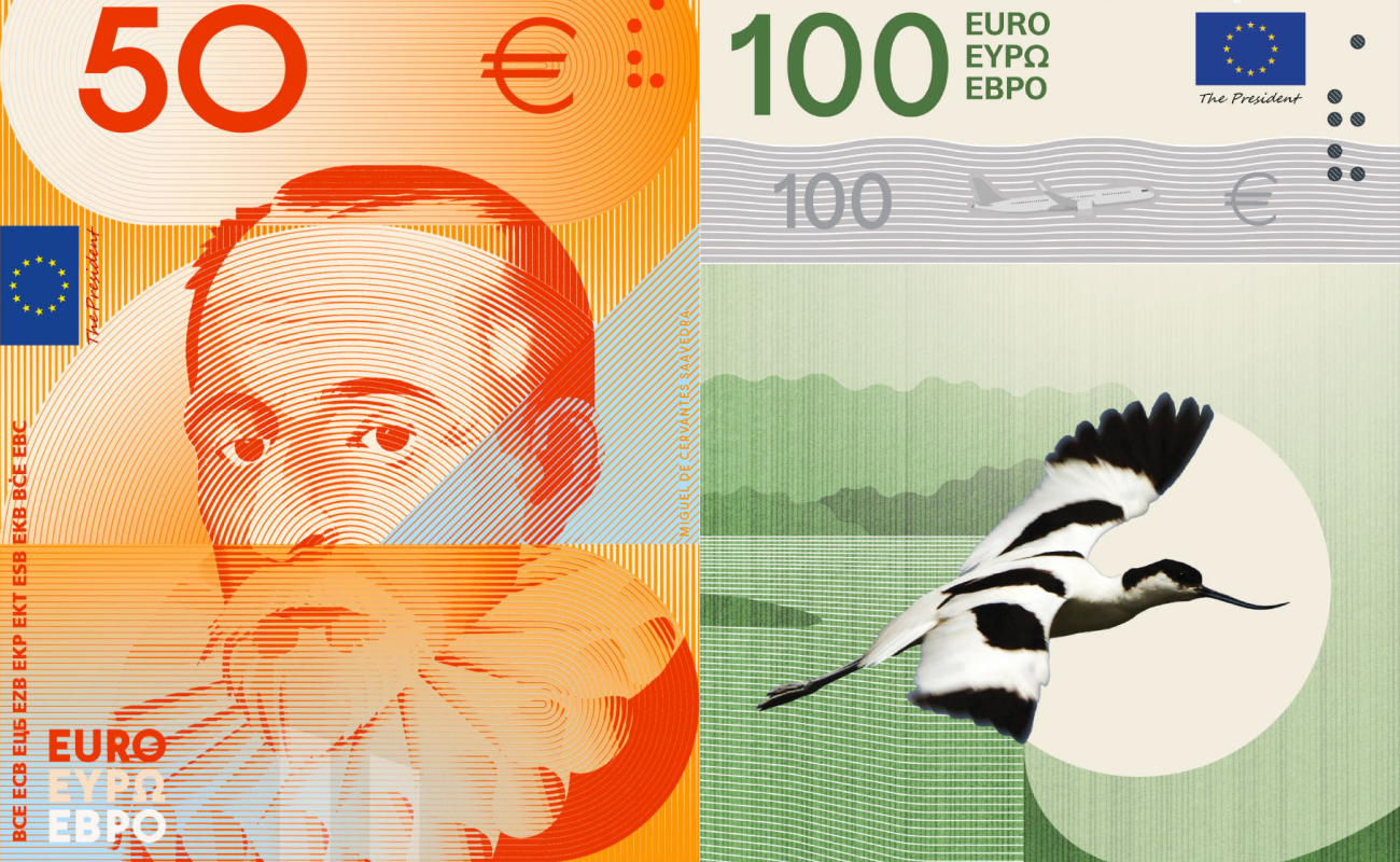
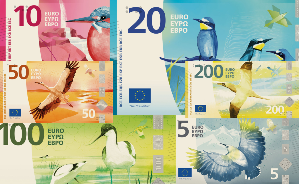
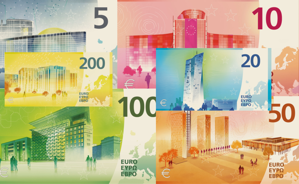
“Water flows. It is the very foundation for life, shaping our environment and the habitats for the rich European birdlife depicted on the banknotes. Also, water can take on many characteristics, such as balance or consistency. Using these qualities as analogies for the EU institutions creates trust and understanding of their functions.
A drop might seem negligible, but over centuries a stream is powerful enough to sculpt mountain ranges. One person might seem insignificant, but millions of people united by a common goal are resilient and powerful. In this light, water is a fitting analogy for the EU.”
If the bird-and-institutions direction ultimately wins, I think this concept could easily become one of the main favorites. It is the most restrained of the bird-based proposals I have seen, while still preserving the familiar feeling of the euro.
There is a strong sense of continuity with the existing banknotes: familiar compositional logic, illustration, color, and security elements, now adapted to new motifs. Looking at it, I genuinely get the impression of the “good old euro,” simply reinterpreted for a new brief.
Visually, everything is handled very carefully. I especially like the €5 note: the bird, mountain landscape, cool palette, and silver security strip work beautifully together. The series as a whole balances renewal and familiarity extremely well. It does not try to destroy the established visual language of the euro, but rather continues and adapts it.
The reverse works according to the same principle. EU institutional buildings are treated in a contemporary way without excessive stylization or any attempt to turn them into something radically unexpected. Color, architecture, the map of Europe, and decorative elements all form a clear and distinctly European system.
To sum it up, this is a very strong concept and, in my opinion, one of the most realistic contenders if Rivers and birds wins. It continues the visual history of the euro while introducing a new concept and remaining restrained and accessible. Personally, compared with the more daring proposals, I see it as a solid middle ground — but that restraint may be exactly what makes it one of the most viable options.
Design I — Isabelle Daëron
Concept description by Isabelle Daëron
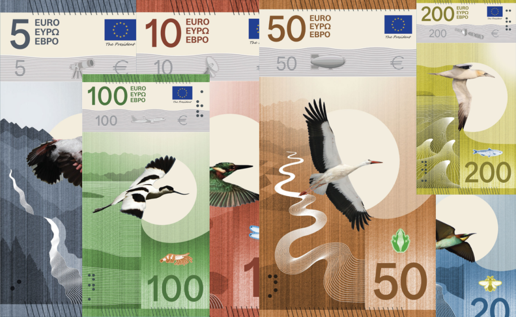
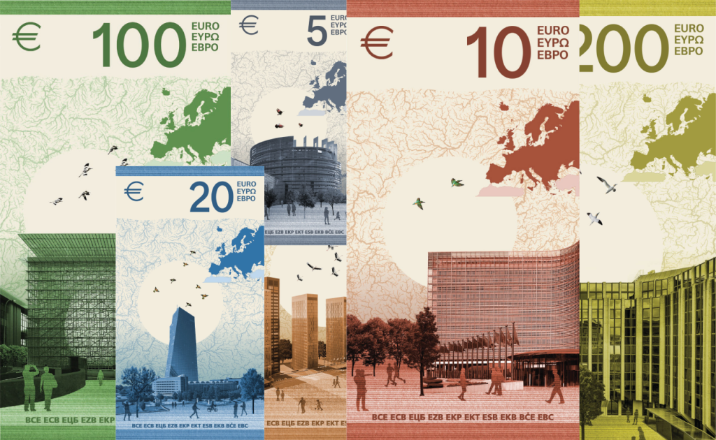
“From the beat of a bird’s wing to the flow of rivers, movement is at the heart of this proposal. It seeks to embody both the dynamism of the EU and the tangible and intangible flows that pass through its territory.
As a true messenger, the bird – appearing alone on the front and as a group on the back – symbolises the dialogue and interdependence between our societies and nature. From a river’s source to the ocean, the bird’s flight reveals the landscape it traverses through the interweaving of two patterns – one hand-drawn in felt-tip pen and the other vector-based – embodying cohesion through diversity.”
Isabelle Daëron’s proposal feels like one of the strongest concepts in terms of both its idea and how carefully the designer works with context. The first thing that stands out is the visual minimalism — almost Japanese in its restraint. Much of that association comes from the large circular form that resembles the sun and becomes one of the defining elements of the front.
The longer you look, however, the more small details begin to reveal themselves. The security strip references different fields of activity — aviation, space, research, science, and telecommunications. Small pictograms next to the birds indicate what they eat: fish, frogs, bees, insects, and other elements. I really like this approach because the details gradually tell the story without the need for a large illustrative scene.
I also love the landscapes. On the front, they work elegantly with the birds, circles, and graphic patterns; on the reverse, the same system develops naturally. EU institutional buildings, the map of European rivers, and groups of birds repeating the motif from the front all make the series feel genuinely cohesive.
The only element I really dislike is the map of Europe on the reverse. It feels too abruptly cropped, and the way North Africa and part of Turkey enter the composition makes this section feel less refined than in some of the other proposals. Still, this is probably my only significant issue with the series.
To sum it up, this is one of the strongest bird-based proposals. It is less conservative than the previous concept but does not try to be avant-garde simply for the sake of it. It has its own visual identity, very strong storytelling, and a huge number of small details that reveal themselves over time.
Design J — Ville Tietäväinen
Concept description by Ville Tietäväinen
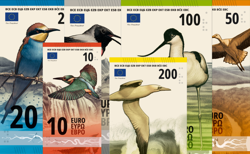
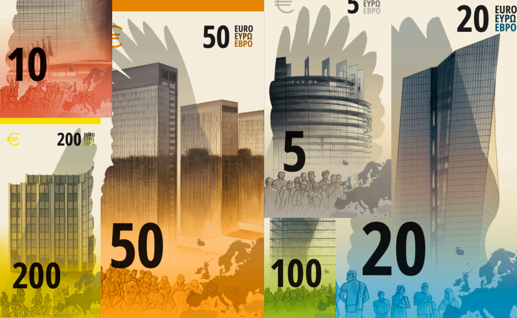
“This euro banknote series tells a visual story of European rivers, from their origins in mountain springs to merging with the sea. The main characters are the European birds in their natural habitats. The higher the banknote denomination, the closer the imagery gets to the sea.
The security foils each show one phase of a river with the associated bird, and work as an infographic device, introducing the narrative concept of the banknote series. Even the EU buildings on the reverse sides of the banknotes merge with the wings of the particular birds on the front sides.”
For me, this is probably one of the most contradictory concepts among all ten. Not because it is the most extravagant or unusual — there have already been much bolder proposals — but because it feels too illustrative and, at some point, stops feeling like currency.
I genuinely like the concept itself. Each bird has its own color, landscape, and visual story. The €5 and €10 work especially well, and the €50 is probably my favorite. I also really like the idea of the birds’ wings on the reverse visually merging with the buildings of EU institutions. That is a genuinely strong conceptual device.
But alongside that, the almost pencil-like line drawings of people feel disconnected from the rest of the system. This becomes particularly obvious on the gray banknote, where gray human figures overlap a gray institutional building. The entire composition starts to feel too muted, rough, and almost sketch-like.
And that brings me to the main question: how much of this is actually about money? As a piece of graphic art, it works beautifully. As illustration, composition, and conceptual thinking, there is plenty to admire. But compared with Design D, H, or I, those proposals still retain the feeling of an actual euro banknote despite their experimentation.
To sum it up, this is not a bad design — it simply feels somewhat misplaced in the context of a banknote. Artistically and conceptually, it may be one of the most interesting proposals in the competition. But as money, it lacks the same sense of monetary credibility for me.
Conclusion
Looking back at both articles, I ultimately want to choose two personal favorites — one from each of the competition’s two conceptual directions.
Among the proposals based on historical figures, Design G by Rubio & del Amo and Cruz más Cruz is the clear winner for me.
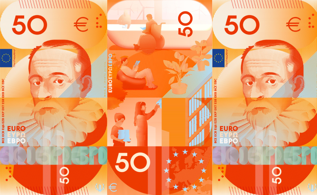
It comes closest to how I imagine the future of European currency. It feels like a genuine breath of fresh air: contemporary portrait treatment, futurism, a complex graphic system, and yet it still retains the feeling of an actual banknote.
The Rivers and birds concepts were much harder to choose between. Almost every proposal had something I genuinely liked, and I spent a long time deciding between Design D and Design I. In the end, however, Design I by Isabelle Daëron became my favorite.
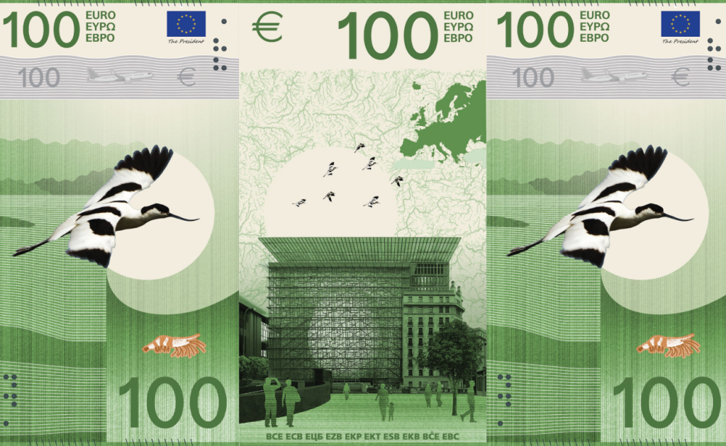
For me, it finds the strongest balance between visual preference, conceptual depth, and — most importantly — the feeling of actual money.
Of course, the final choice is not mine to make. But whatever the outcome, I find it difficult to imagine a genuinely weak winner among these ten concepts. Every one of them was created by exceptionally talented designers and artists who interpreted the same brief in completely different ways.
And perhaps that is the main impression I am left with after this entire review. Even the proposals that do not personally resonate with me still make me want to look closer, analyze them, and understand how they were conceived. These projects genuinely make you want to create, experiment, and remind yourself how powerful graphic design can be when there is a real idea behind it.
Sources
All banknote images, official concept descriptions, and competition information are sourced from the European Central Bank.