

Mikay Scissors
The Task
Artem Mikheev is an independent hairstylist who recently relocated to Canada. Entering a new market meant building recognition from the ground up and creating a more defined identity around his work. Previously, he worked under his own first and last name, but the name was not the easiest to pronounce or remember for an English-speaking audience. The personal connection was retained while adapting the name to a new context, resulting in Mikay Scissors. The new identity needed to reflect Artem’s character, precision and personal approach to his craft while remaining distinctive and easy to recognize. A logo and visual system were then developed to work consistently across different brand touchpoints.
A Personal Voice
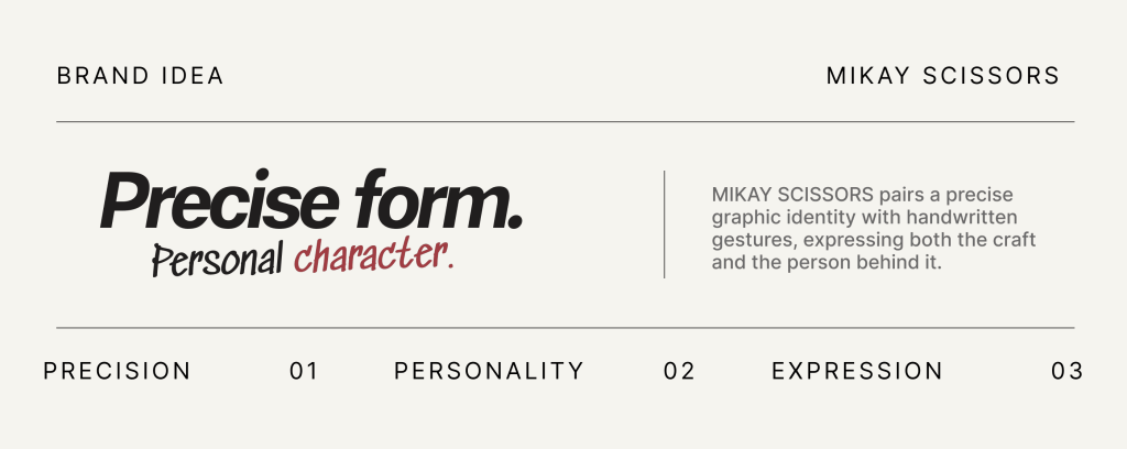
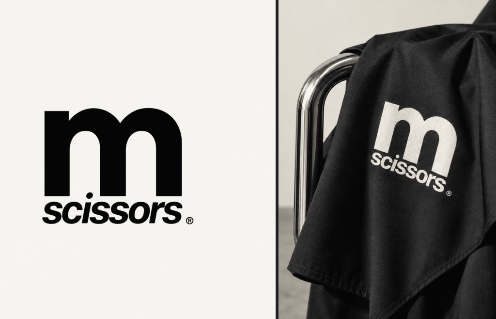
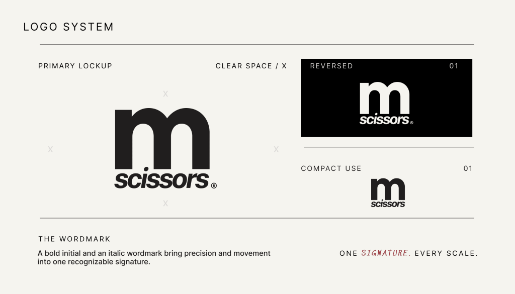
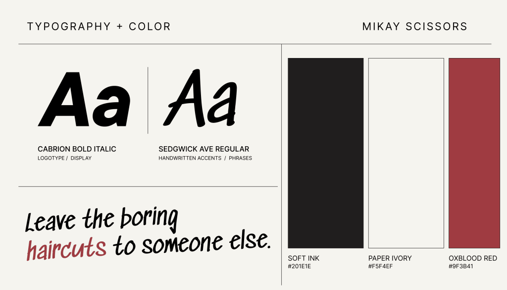
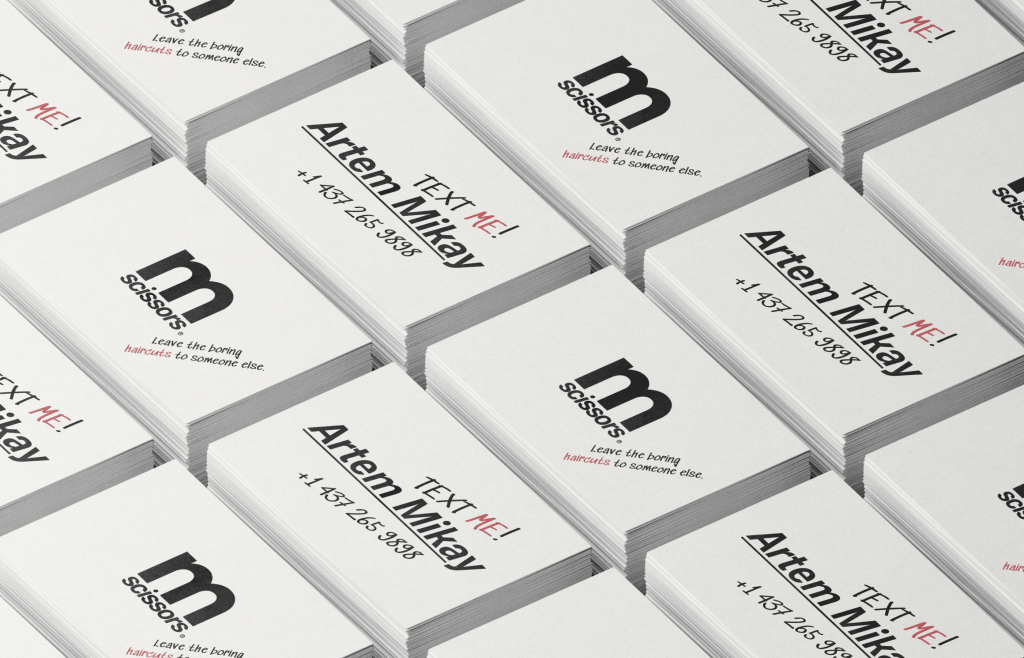
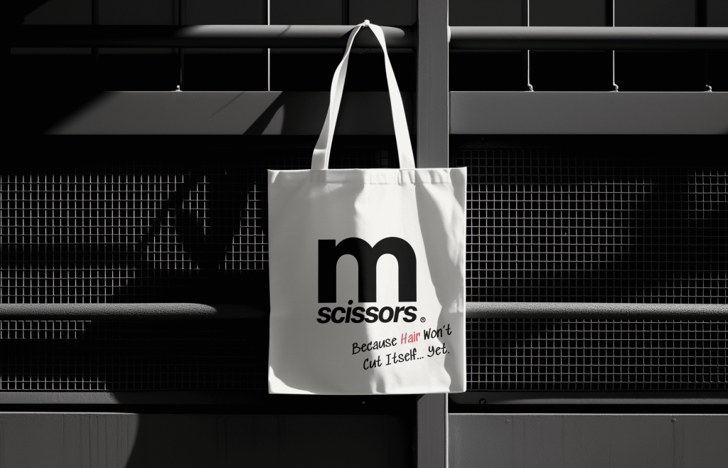
The logo gives Mikay Scissors a bold, consistent signature. Handwritten phrases introduce Artem’s voice: direct, informal and a little irreverent. This contrast runs through the identity. Structured typography keeps information clear, while loose lettering and muted red accents make room for personal remarks. “Text me!” turns a business card into an invitation; “Leave the boring haircuts to someone else” expresses the brand’s attitude.
Art Direction
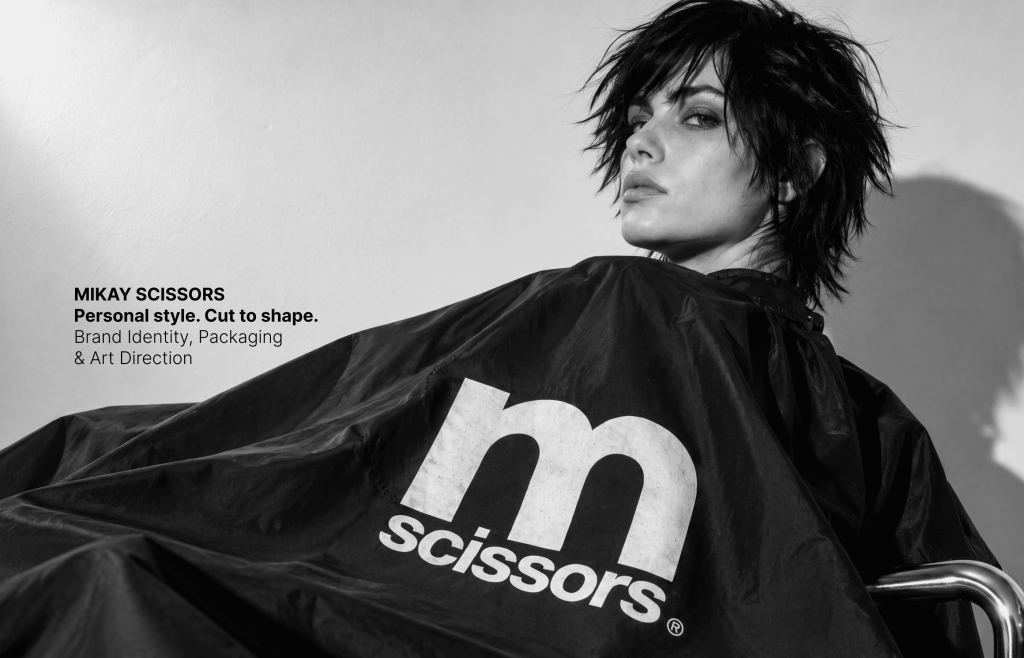
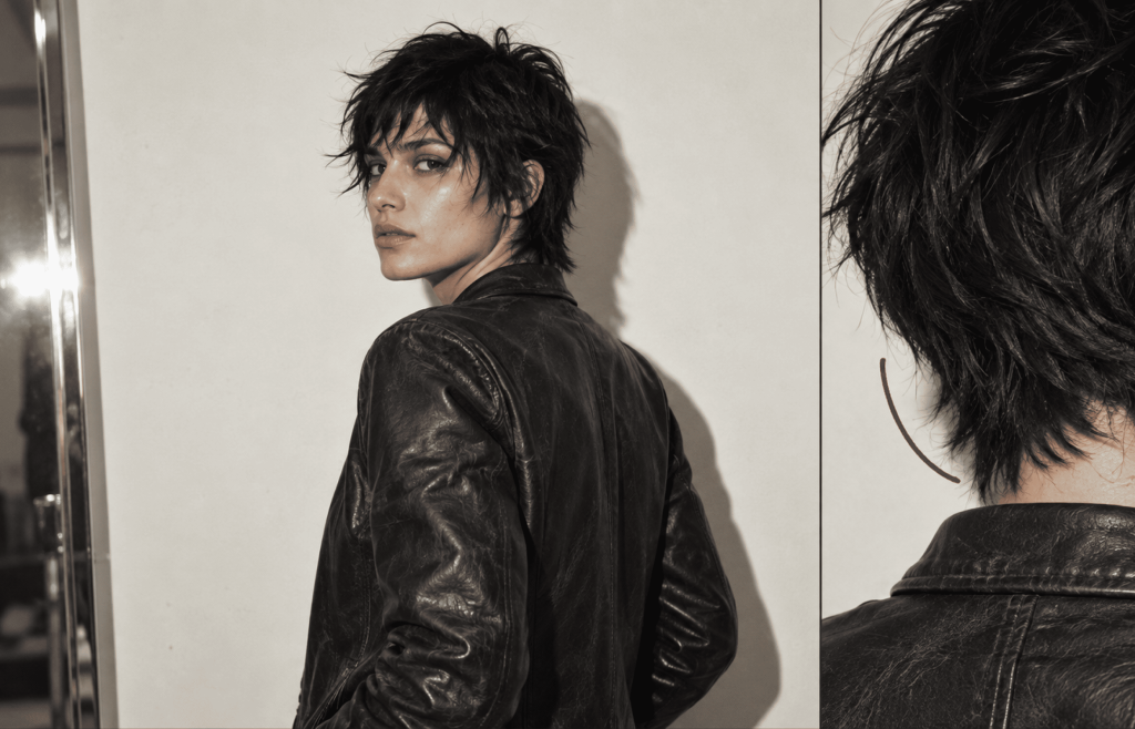
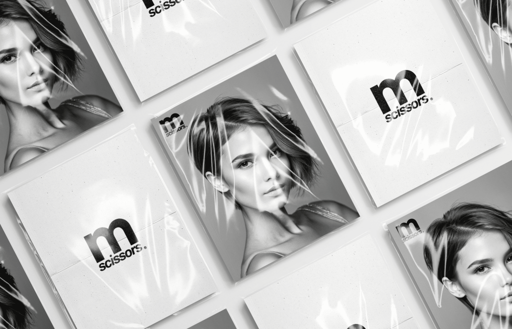
The visual direction draws on mid-2000s fashion imagery and industrial minimalism. Expressive hair, leather, monochrome photography and close crops establish an attitude that carries across the brand. Paper ivory and soft black form the foundation, with chrome surfaces and muted red marks adding contrast. Precise layouts sit alongside handwritten gestures, connecting the visual world to the same balance of control and individuality found in the logo.
Haircare Packaging
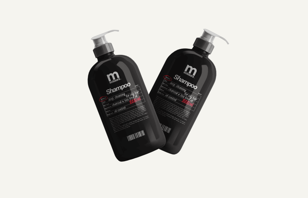
The identity extends into a shampoo range, where the same graphic language takes on a practical role. A structured label organizes product information, while handwritten entries and red annotations suggest the personal notes of a stylist. The prominent logo, restrained palette and consistent hierarchy connect the packaging to the wider brand, carrying Artem’s personal approach into an everyday haircare product.
The Outcome
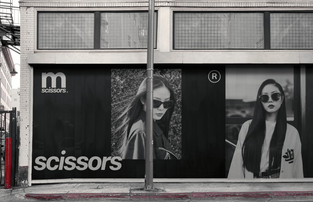
Mikay Scissors brings Artem’s name, professional identity and personal voice into one coherent brand. Naming and positioning are connected with a distinctive logo, typography, color, art direction and applications across print and haircare packaging. A consistent graphic foundation allows the brand to move between a business card, a shampoo label and a large-format visual while keeping the same recognizable character.