Almarin
The Problem
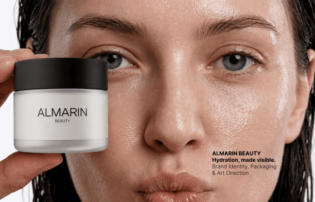
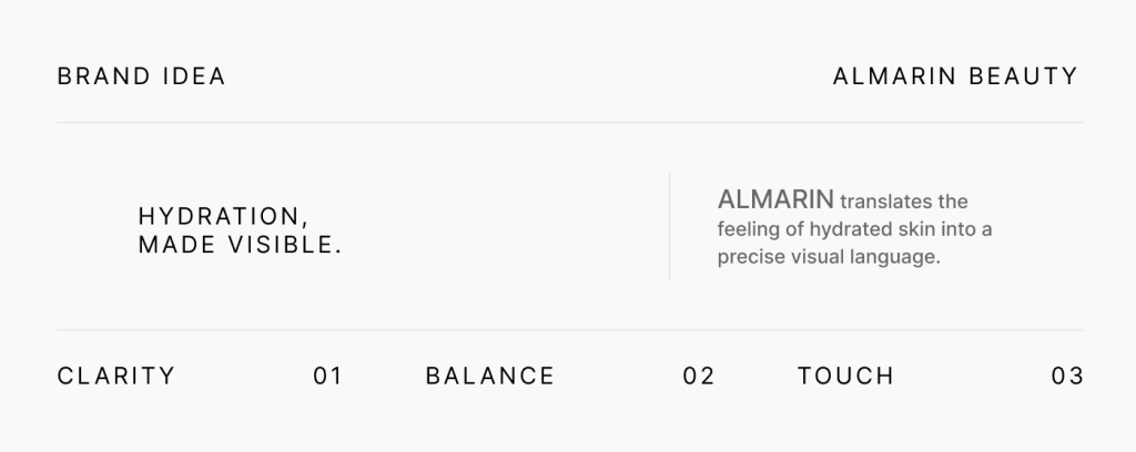
Skincare shelves are filled with brands using the same clinical language, pale color palettes and idealized imagery. Minimalism has become the category default—and, as a result, many products disappear into sameness. ALMARIN needed a quiet identity that could still hold attention while keeping the product, texture and skin at the center.
The Challenge
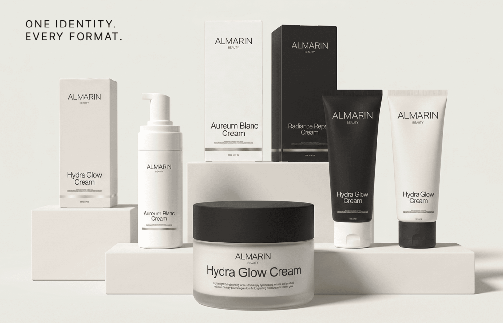
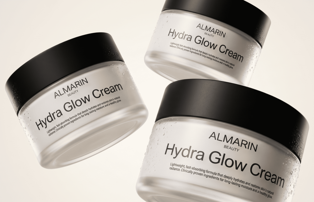
Hydration is both functional and emotional: it is communicated through ingredients, but experienced through touch, comfort and visible glow. The identity had to connect these two sides, work consistently across tubes, jars, cartons and digital imagery, and remain recognizable without relying on decorative graphics or loud color.
The Approach
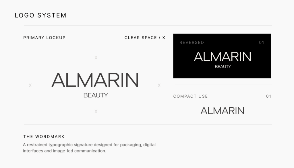
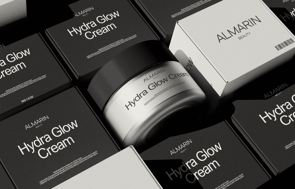
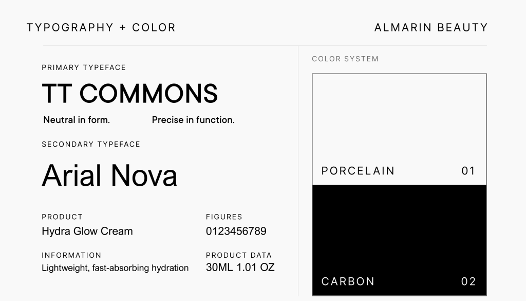
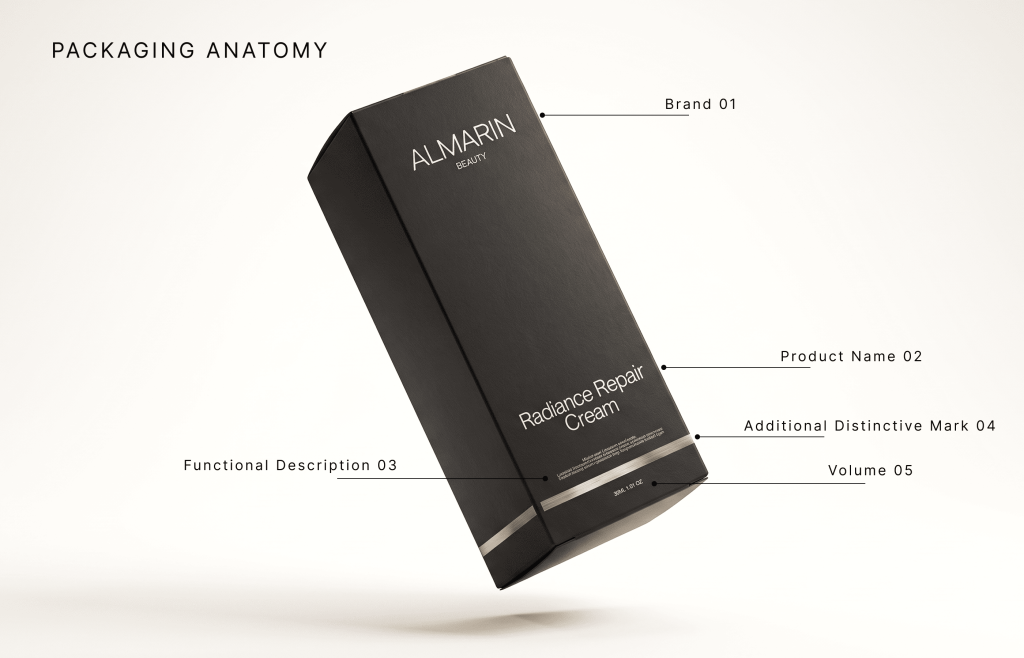
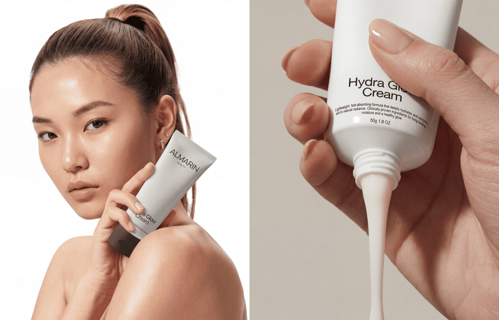
The system was built around controlled contrast. Soft skin, reflective formulas and close-up photography are paired with precise typography and a strict black-and-porcelain packaging structure. The wordmark stays restrained, while scale, negative space and alternating light and dark surfaces create recognition across every format. A clear information hierarchy allows the product range to expand without losing clarity.
The Result
The resulting system positions ALMARIN as a calm but distinctive beauty brand—minimal without feeling empty and premium without relying on decoration. Identity, packaging and campaign imagery follow one clear visual logic, giving a consistent presence across retail, e-commerce and social communication.