

Euro Redesign: Bold New Banknote Concepts for a Conservative Bureaucracy
Design A – Studio Joost Grootens
Concept description by Studio Joost Grootens
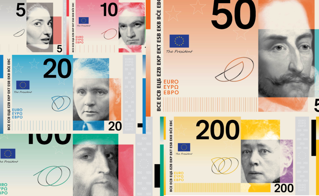
“The design can be explained as a reflection on how culture is formed. The eyes represent observing, sensing and reflecting, while the mouth symbolises expression, dialogue and exchange. By focusing on these elements, the portraits move beyond individual identity towards a shared human capacity for cultural production.
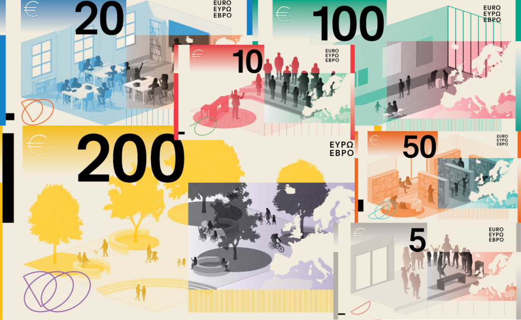
On the reverse, contemporary cultural spaces show people of different backgrounds and ages meeting and interacting. Together, the two sides connect individual perception and expression with collective exchange, inviting the public to see the banknotes as representations of culture as a living, shared process.”
Using historical figures on banknotes is nothing new, but in the case of the euro it is especially interesting because the currency was originally built around almost the opposite idea. The first two issued series of euro banknotes avoided real monuments and bridges, instead using fictional architectural motifs inspired by different periods of European history. This allowed the visual system to remain disconnected from any one specific country. More about the current euro banknote design — ECB
Interestingly, those fictional bridges eventually became real. Seven bridges inspired by the euro banknotes were later built in Spijkenisse in the Netherlands. ArchDaily Against that background, Studio Joost Grootens’ decision to bring specific historical figures back onto the euro feels fairly bold.
Visually, I genuinely love the front of these banknotes. The black-and-white, almost noir-like portraits contrast beautifully with the bright colors of the notes. More importantly, the portraits are not simply placed onto the banknote — they are integrated into its geometry, divided into rectangular areas, overlapped by fields of color, and turned into part of the overall graphic system. Despite the large number of elements, the composition never feels overloaded. The whole thing feels flat, fresh, and distinctive, while the color and typography make it feel like a genuinely contemporary approach to currency design.
My impression of the reverse is almost the exact opposite. I understand the idea of showing contemporary cultural spaces where people of different ages and backgrounds interact, and conceptually it continues the front quite logically. Visually, however, it works much less convincingly. The photography, geometric elements, and muted colors begin to resemble an architectural presentation rather than the banknote of one of the world’s strongest currencies. Even the silhouette of Europe gets lost in the background in places. As a result, the front feels bold, controlled, and full of character, while the reverse feels simultaneously too muted, too busy, and noticeably less resolved.
To sum it up, I really like the overall approach, both conceptually and visually. These are genuinely strong banknotes with a cohesive and innovative concept, especially in the way they rethink portraiture and the traditional visual language of currency. At the same time, the reverse still feels slightly underdeveloped to me. It almost feels as if the front and reverse exist in two parallel realities: the front looks like it was built carefully, slowly, and obsessively, with every detail considered, while the reverse feels as if it was assembled in a rush just to get the project finished.
Design B — PunktFormStrich
Concept description by PunktFormStrich
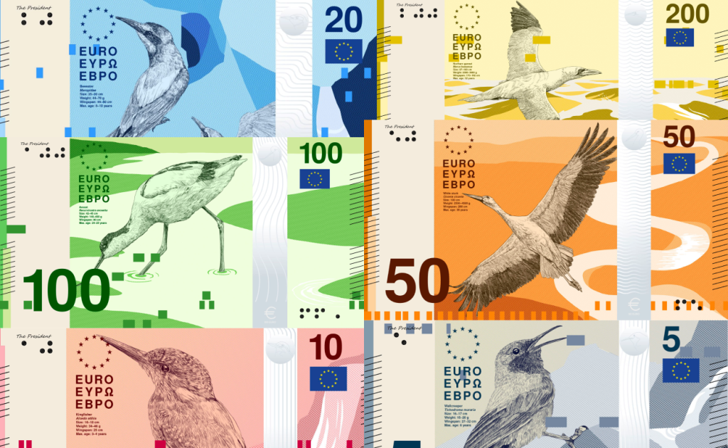
“The ‘Rivers and birds’ banknote series communicates its concept through a direct connection between visual elements and their meaning. Each banknote presents a specific bird species in relation to its habitat, linking biodiversity with European landscapes. Horizontal bar structures translate the individual sound of each bird into a visual form, while a vertical scale indicates its flight speed, enabling an intuitive reading of the information. Concise data on the front further contextualise the species.
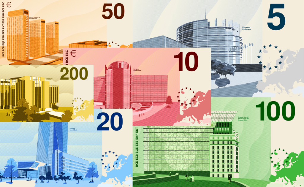
On the reverse, EU buildings and the map of Europe establish a connection between natural environments and shared cultural identity.”
Looking at all the concepts in the competition, you can really feel how specific the brief must have been. In the case of Design B by PunktFormStrich, I like the visual language itself: realistic bird imagery combined with highly minimal, flat design, along with the use of information about the birds and elements of the surrounding landscape. Everything looks clean and well executed, but for me the series feels too sterile. It is a very recognizable kind of millennial design — a collage of realistic illustration and flat graphics that looks pleasant but never develops into a particularly strong or memorable visual idea.
Some denominations work noticeably better than others. My favorites are the €5, €10, and €20 notes, where the fronts feel more balanced and visually complete. The €50, €100, and €200 notes already start to feel slightly empty, as if the minimalism has gone a little too far. Everything is professionally and carefully designed, but it becomes so clean and safe that at some point the design simply stops creating any real emotional response.
The reverse gives me almost the same feeling. I like the underlying idea of using buildings associated with European institutions rather than national landmarks from individual countries. Those motifs were part of the predefined brief for the Rivers and birds theme. Design Contest Jury Report — ECB But everything is executed so cleanly and so correctly that the banknotes barely leave an impression. I cannot call them bad — quite the opposite, they are well made and professionally assembled — but I can easily imagine seeing a similar concept among high-quality stock design work or in a collection of polished graphic design references.
To sum it up, this is a genuinely strong piece of work. But sometimes a strict creative brief can limit even very talented designers, and I think this may be one of those cases. The level of execution and the strength of the design foundation are obvious, but within the given direction I feel that one additional step was missing — something that could have turned a good concept into an exceptional one. I genuinely like the €5, €10, and €20 notes, but overall the series feels fairly forgettable to me.
Design C — Neue Gestaltung GmbH
Concept description by Neue Gestaltung GmbH
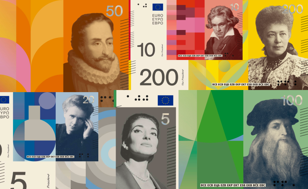
“The design tells a simple story: Europe is a shared cultural space. Each banknote is instantly identifiable by its dominant colour and its own central motif; each portrays a personality whose life and work connects Europeans across centuries.
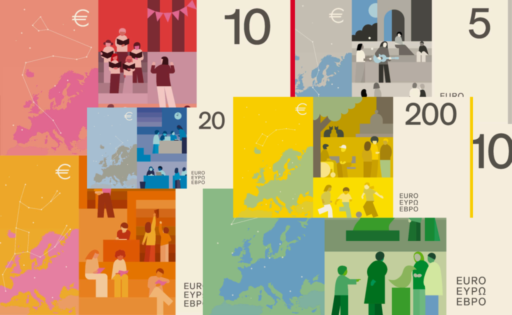
The reverse pairs a map of Europe, lightly overlaid with the constellations that have long guided travellers, with a present-day scene of the cultural space the note represents – performing arts, music, schools, libraries, museums and public squares. People are rendered without specific features so that citizens can recognise themselves in them.”
To be honest, with all due respect to the studio, this concept feels fairly weak to me. The one element I genuinely like is the translucent denomination placed next to the portraits. It works well with the color and adds some character to the notes. Everything else feels as though it belongs to completely different visual universes. Combining realistic historical portraits with extremely flat graphic design is already a risky choice, and in this case I do not think it works. Instead of creating continuity between the elements, the portrait and the geometric composition often feel as if they were simply placed next to each other, while some of the geometry seems to exist purely for the sake of geometry.
The problem for me is not the historical figures themselves. The €5 features Maria Callas, the €10 Ludwig van Beethoven, the €20 Marie Skłodowska-Curie, the €50 Miguel de Cervantes, the €100 Leonardo da Vinci, and the €200 Bertha von Suttner, an Austrian writer and Nobel Peace Prize laureate. These figures and their associated cultural themes were defined in advance as part of the ECB competition brief. Design Contest Jury Report — ECB
The real issue is how the portraits are integrated into the design. They come from completely different sources, appear at different angles, and have very different visual qualities. Once they are cut out and placed against monochromatic flat backgrounds, those differences become even more obvious. On the €5, Maria Callas is surrounded by an abstract geometric composition; on the €10, the musical reference is clear; on the €50, the book and library theme is easy to understand. But I still do not see a strong visual system that truly connects these motifs to the portraits.
The reverse feels even weaker to me. It uses the same idea of people interacting within a shared European cultural space, but visually it is presented in the language of late-2010s and early-2020s minimalist illustration — the kind of style that is very easy to imagine on a stock website. The composition attempts to include the map of Europe, constellations, scenes of human interaction, and large fields of color all at once, but the number of ideas does not make the design deeper. Instead, everything feels extremely safe and familiar. If the realistic portraits on the front stand out too aggressively from the flat environment, then on the reverse the flat style itself becomes too generic and impersonal.
To sum it up, combining realistic portraiture with flat design is a very dangerous technique. When handled properly, it can produce an incredible result, but it requires a very precise stylistic relationship between the image, color, geometry, and the entire banknote system. Here, in my opinion, that relationship was never fully achieved. Individual elements may be interesting on their own, but the series never comes together into a unified visual language, and so far this is one of the weakest concepts for me.
Design D — Rudy Guedj and François Girard-Meunier
Concept description by Rudy Guedj and François Girard-Meunier
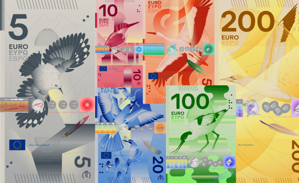
“Six birds appear within abstracted landscapes, connected by the continuous journey of a river, from a mountain source to a stormy sea. Light accompanies this progression, evolving from a soft presence into a dynamic, incisive force with symbolic resonance. The scenes invite close inspection, placing the viewer in the position of a birdwatcher, gathering traces of each species.
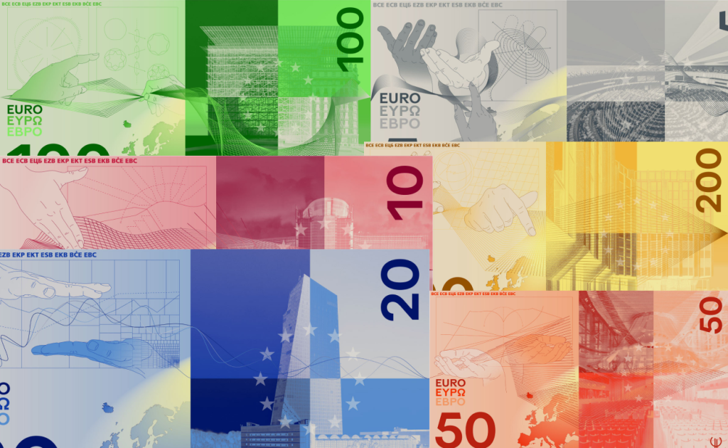
On the reverse, EU institutions are expressed through human gestures and a morphing fabric-like mesh. Hands hold, stabilise, align and debate, suggesting cooperation in action, while light radiates from each building across the EU territory.”
I love vertical banknotes, and I especially love when they contain a certain amount of visual excess — in the best possible sense — while still remaining easy to read. The front of this series does exactly that. The underlying composition is fairly minimal, with elements that at times remind me of 1980s graphic design: grids, technical lines, translucent layers. At the same time, an incredible amount of work has clearly gone into the bird illustrations and the way they are integrated into the overall composition.
I especially like the central security strip with its many small elements connected to each bird. Combined with the light, iridescent effects, and color combinations, it feels extremely avant-garde and unusual. The front feels complete, distinctive, and almost like the total opposite of the more conservative concept before it. This is where, in my opinion, the bird theme is finally presented exactly the way it should be.
The reverse genuinely impressed me. The use of hands, realistic images of European institutions, mesh structures, and light looks fantastic. What works particularly well is the additional design idea: the hands do not simply exist inside the composition, they actively interact with the meshes, giving the entire system another layer of meaning. The map of Europe, EU stars, and images of the institutions are also integrated beautifully, while the color palette, translucent layers, and lighting effects are incredibly well handled.
My only real question concerns the orientation of the composition itself. The front is clearly designed as a vertical banknote, while the reverse begins to operate in two directions at once: some elements are read vertically, others horizontally, and even the denomination changes direction. For me, this creates a small amount of visual ambiguity, but it does not damage the overall impression at all. The series remains bold, complex, and surprisingly cohesive.
To sum it up, this is one of the strongest concepts among all ten for me. What works especially well is the way the designers handled the concept itself: they did not simply execute the assigned theme, but added their own visual layer to it. The hands interacting with the mesh are not there purely for decoration — they add another idea that can actually be read and understood. The result is a highly distinctive, unconventional, and genuinely unusual approach to the euro that remains coherent despite its visual density. Of all the concepts I have looked at so far, this is one of the ones that has left the strongest impression on me.
Design E — Myrsini Vardopoulou
Concept description by Myrsini Vardopoulou
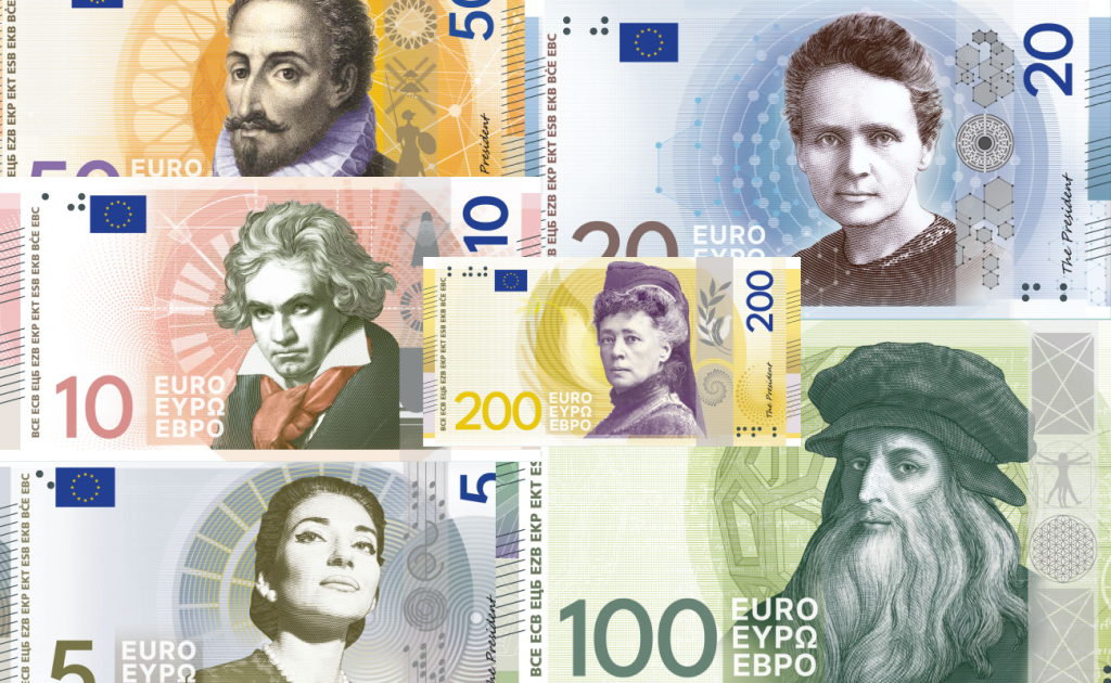
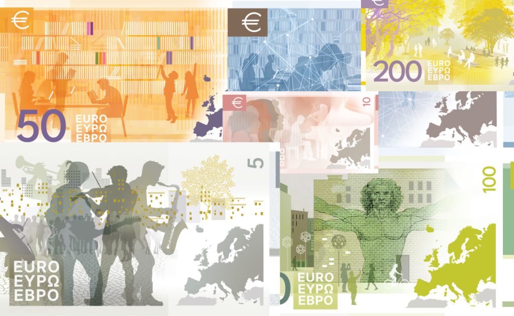
“The communicative approach focuses on the universal value of each person’s work rather than their personality. The circle and the symbols function as a visual message denoting an intellectual space. This space offers the viewer immediate visual familiarity. Simultaneously, symbolic details provide subtle references for a deeper conceptual reading. In this way, the design communicates that, despite the diversity of the individuals, their contribution constitutes a unified source of inspiration and a means of reconnecting with familiar, yet ever-evolving cultural values.”
For me, this is classic classicism. Looking at these banknotes, I could not shake the feeling that I was looking at European currency from before the euro existed. There are easy associations with old francs, Polish złoty, and European banknote design in general from previous decades. But personally, the visual language of this series reminds me most strongly of the Ukrainian hryvnia. The treatment of the portraits, the positioning of additional elements around them, and the overall structure of the front all create that association for me.
Unlike the previous Design C, however, the portraits here are genuinely stylized and clearly belong to the same system. They do not look like randomly cut-out photographs and they interact with the surrounding graphics much more naturally. The additional elements referencing each historical figure are also integrated quite carefully.
I like the reverse much more. The idea of people interacting within a shared European cultural space is developed in a much more interesting way here: the library on the €50, the musicians on the €5, the Vitruvian Man on the €100 — these are no longer simply background elements but full scenes in which people and cultural environments coexist. They feel noticeably more contemporary and avant-garde than the front, which creates an interesting contrast. On one side, you have a very traditional banknote aesthetic dominated by large historical portraits; on the other, much freer compositions with human silhouettes, architecture, maps, and cultural symbols.
Because of this, I am left with a slightly mixed impression. The front is extremely conservative and at times even old-fashioned. If you placed it next to European banknotes from forty, fifty, or even seventy years ago, it could easily exist among them. Even the contemporary Ukrainian hryvnia feels slightly more current in certain respects. But I also cannot call that a flaw in itself. The front is well executed, consistent, and much more cohesive than the previous concept, while the reverse brings a necessary sense of modernity into an otherwise traditional system. The entire series ultimately depends on that contrast.
To sum it up, these are good, visually strong banknotes with a clear connection to the history of European currency design. The portraits are handled well, the symbols associated with the historical figures are thoughtfully integrated, and the reverse explores the cultural theme in an interesting way. But for a redesign of a modern European currency, I would still like to see a little more courage. It is a beautiful and cohesive concept, but at its core it remains too conservative — especially when compared with some of the other proposals in the competition.
To be continued
When I started looking into the new euro designs, I thought all ten concepts would easily fit into a single article. In reality, the subject turned out to be much broader than I expected. Each concept deserves to be looked at individually — not only on the level of “I like it / I don’t like it,” but also in terms of how differently designers respond to the same brief and how differently they imagine the visual language of a contemporary European currency.
So I will cover the remaining five concepts — Design F–J — in Part 2. That is also where I will try to choose my final favorite among all ten concepts and answer the main question for myself: what should the new euro actually look like?
All banknote images, official concept descriptions, and competition information are sourced from the European Central Bank. Additional sources and references are linked directly throughout the article.